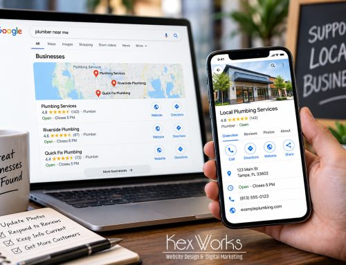
In today’s digital world, mobile devices have become the primary way people access the internet. As more users shift to mobile, businesses must adapt by prioritizing mobile-first web design. This approach ensures that websites are optimized for the mobile experience before scaling up to larger screens. Here’s why mobile-first web design is essential and how it benefits your business:
1. Enhanced User Experience
Mobile-first design focuses on creating a seamless experience for users on smaller screens. By prioritizing simplicity and usability, your website becomes more intuitive and easier to navigate. This leads to a better user experience, which is crucial for keeping visitors engaged and reducing bounce rates.
2. Improved SEO Performance
Google’s mobile-first indexing means that the mobile version of your website is considered the primary version for ranking purposes. A mobile-first design ensures that your site is optimized for mobile users, improving your search engine rankings and making it easier for potential customers to find you.
3. Faster Load Times
Mobile-first design emphasizes speed and efficiency, which are critical on mobile devices where users expect quick access to content. By optimizing images, minimizing code, and reducing unnecessary elements, your site loads faster, providing a better user experience and reducing the likelihood of users leaving due to slow load times.
4. Higher Conversion Rates
A mobile-first approach can lead to higher conversion rates by making it easier for users to complete actions on your site, such as making a purchase, filling out a form, or signing up for a newsletter. Simplified navigation, clear calls to action, and streamlined checkout processes all contribute to a smoother user journey, resulting in more conversions.
5. Broader Audience Reach
With more people using mobile devices than ever before, a mobile-first design ensures that your website reaches the widest possible audience. It caters to users who rely on their smartphones and tablets for browsing, shopping, and accessing information, expanding your potential customer base.
6. Future-Proofing Your Website
As technology continues to evolve, the importance of mobile-first design will only grow. By adopting this approach now, you’re future-proofing your website, ensuring that it remains relevant and functional as mobile usage continues to rise. A mobile-first design also makes it easier to adapt to new devices and screen sizes as they emerge.
7. Cost-Effective Development
Designing for mobile first can be more cost-effective in the long run. By starting with the smallest screen and scaling up, you can create a streamlined design that requires fewer adjustments for larger screens. This approach can reduce development time and costs, making your project more efficient.
Conclusion
Mobile-first web design is no longer just an option; it’s a necessity for businesses that want to stay competitive in today’s mobile-centric world. By focusing on mobile-first principles, you can enhance user experience, improve SEO, increase conversions, and future-proof your website. At KexWorks, we specialize in creating mobile-first websites that deliver results. Let us help you design a site that meets the needs of your mobile audience and drives your business forward.